The strange case of the Illegible logo
by ALEC SMART
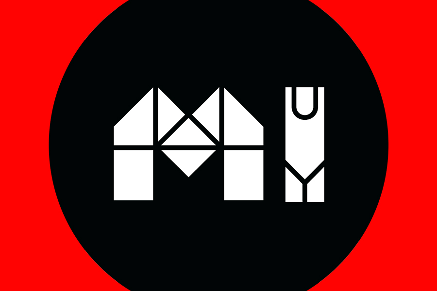
The new logo for the Inner West Council (IWC) has ruffled feathers across the inner-west region. Opponents criticise the text legibility and its significant costs, propounding that the public should have been more involved in the decision-making process, especially since ratepayers financed the project.
And, surprisingly, it cost $90,000 of inner-west ratepayers money to design the semi-legible font.
Yes, you read that right, $90,000 for some graphic design work.
Motion quickness
On 3 Feb the new logo, an industrial-looking white IW in a black circle, was added on the IWCs Facebook page when they updated their profile picture, but there was no accompanying public announcement. Thereafter several Facebook users who posted derisory comments on the IWCs profile page, mocking the new logo, found their posts deleted.
On Tues 11 Feb the IWC met for their fortnightly ordinary meeting where the issue of the new logo was added to the agenda by Councillor Julie Passas.
Her motion decreed: That Council receive a full report on the new logo, name of the successful group or person, cost of the logo, meetings, staff time and other resources. Amount to be paid to the successful tender and who decided on the logo for our Council
Councillors have been sent a copy of the new Council logo and were told it was to be made public on the 3 February 2020. Please advise why Councillors were not given the opportunity to comment on or approve the new logo.
However, the minutes of the 11 Feb meeting reveal it was dominated by other issues and councillors ran out of time to discuss Cr Passas motion, item number 16 C0220(1), which youll find if you scroll way down to page 95.
Meantime, a lively discussion on the new logo was being held across social media, particularly on Councillor John Stamolis Facebook page where ratepayers who financed it found plenty of time to review and respond.
Opinions were overwhelmingly disparaging.
Cr Stamolis told City Hub: I initiated this whole debate on the logo on Monday morning with a Facebook post thats now received over 20,000 viewers. From there it spun off to an ABC Poll, then another community group had a poll and [Newtown Greens MP] Jenny Leong also commented.
Three polls are showing that people just dont like it. ABC show 60% against and this would include people outside the Inner West. If we look inside the Inner West, opposition is between 75% to 90% depending on which source you look at.
Councillor Pauline Lockie also posted the new logo on her Facebook page on 11 Feb, similarly stoking considerable (albeit less) criticism.
The public comments on the two councillors Facebook posts range from
the serious:
??I can see the symbology in the type design, but overall it is a fail. it’s maybe trying to be edgy, but it already looks outdated.?
?Our LGA is among the most multi-cultural in the nation. Clarity of communication is paramount. This logo is barely decipherable for native English speakers. Try again.?
?Interesting concept but poorly executed. There are plenty of readable fonts similar to this you could have chosen to get the same effect.?
?Who else submitted designs? Was there a design competition??
?It’s a ‘fun’ throwaway logo for something child-related, whereas council should be represented by something with a bit more gravitas?.
??Mixed response is code for: we got slammed for this pixelated awful design but we already paid for it, so were keeping it?.
to the hostile:
??What a complete pigs breakfast. The graphic designer who put this together needs to be looking for a different career.?
?It doesnt look at all like a logo for an organisation I feel confident paying rates to, or who can manage our libraries and our waste services.?
0/10. ?I am a Marketer & Brand Consultant with a long experience in branding, re-branding and this is definitely not a case study for a great logo. I support the other comments that this is a waste of money and totally unnecessary.?
… to the witty:
?The kid in year 7 that designed the Newtown High logo couldve done a better job!?
?It looks like a school project I did in year 5 with crayons!
?Looks like a jigsaw puzzle put together all wrong!
?It’s nice for colouring-in practice.. limited use after that?!
?It looks like the logo of a childrens day care centre!?
?Did someone forget to hold back the release of this logo till April 1??!
Although the logo received a sprinkling of supportive comments (if one scrolls down far enough):
?Everything new is hated for a while, then everyone gets used to it. This will be no different. It’s playful enough and distinctive – I await seeing it in a variety of applications, but I quite like it.?
?I personally quite like the concept and thinking behind it. I see that it incorporates elements in architecture and planning.?
Balmain Greens MP Jamie Parker also weighed-in on the discussion via a Facebook post on 11 Feb: This looks like another own-goal from the Labor/Liberal coalition that run the Inner West Council, with this new unreadable logo branding project at a cost of over $90,000.
Brutalist bridge
City Hub inverted the industrial-type lettering of the new IW logo and submit that it resembles a man in 1950s swimming costume stood beside a Brutalist interpretation of the Anzac Bridge (see photo illustrating this article).
In responding to the negative comments on her Facebook post, Cr Pauline Lockie said: I have no issues with folks discussing it – everyone’s entitled to their views. But I don’t think Council officers did anything wrong here. They followed the process that had been endorsed by a majority of Councillors.?
Councillor Lockie opposed the original proposal for the IWC to adopt new logos although she was ultimately chosen by Mayor Darcy Byrne to join the panel approving the designs.
The chosen logo’s quite different to the last versions I saw, she declared on Facebook. I don’t have particularly strong feelings about it, though I understand why others do. What baffles me is that some of the councillors who are now protesting about the logo also voted for the rebrand, and endorsed the rebranding process.
Cr Stamolis backed the rebranding for a new logo. However, as he revealed to City Hub, the original proposal, supported 9-6 by IWC councillors, came with multiple references to community involvement and a consideration that: the winning designer receive $20,000 and the top ten designers receive $1000 each for the winning design substantially less than the final pay-out of $90,000.
Cr Stamolis insists he originally supported a new logo because he believed the community participation voted on in the proposal would be honoured. He told City Hub: In five parts of an eight-part resolution it specifically mentions the word community. What part of that would lead me think that the community wouldnt be engaged in the design and consultation and final decision? The resolution was clear we involve the community.
To confirm, the five points of the original proposal referred to by Cr Stamolis unequivocally assert community involvement:
2. Support the establishment of a panel of nine people
to determine selection criteria
and oversee the broad engagement strategy to involve the community in decision-making for the final visual identity;
4. Consider asking the community to design our logo;
5. Consider inviting prominent members of the community be on the decision panel or full Council;
6. Consider putting alternative options for logos on Councils website for a community vote;
7. Consider asking its community if it would like to continue with the name Inner West Council or choose from other options;
$90,000 logo bill
When City Hub asked Cr Lockie whether $90,000 seemed an extraordinary fee for straightforward graphic design work, Ms Lockie replied: The budget was approved by a majority of Councillors at its meeting on 26 June 2018, at the same time they voted to embark on the rebrand, and approve the rebranding process.
I didn’t vote in favour of the rebrand, as I felt residents should have a say as to whether they wanted our merged Council to stay prior to us spending money on this. I was also conscious that many residents would feel Council had bigger priorities from a service delivery or budget perspective.
I work in the communications industry, and this wasn’t just a straightforward graphic design project. It was a full visual identity – so not just one logo, but multiple versions that would work across the many formats that every Council uses for its communications (letters, brochures, reports, submissions, social media platforms, websites, etc etc etc).
The agency also needed to deliver templates for executing the designs, as well as full guidelines with new fonts, colours, design rules, and so on. They also delivered versions that stretched the original concept to show where it could be taken in future, such as with takeovers by local artists.
The previous rebrand, which took place after the Inner West Council was formed from a forced merger of Marrickville, Ashfield and Leichardt Councils a process overseen by the NSW Liberal Govt in May 2016 – came up with a bold, legible font, although the choice of a regional map alongside was a bit vague – it could have been an inkblot or a puddle.
Legibility eligibility
On its legibility from a distance, Ms Lockie said: I think a lot of logos would struggle to be legible from a distance, unless they’re already well known – e.g. Nike, Coke, McDonald’s, Apple – or blown up to billboard size. So I don’t think that’s a fair test.
In regards to any logo, the goal is to create a visual reference that people identify as yours. Certainly the objective was to create a visual identity that would last and be relevant. Like anything creative, the final judgement on that is often very subjective, and in the eyes of the beholder. I suspect the current furore though means people will at least know it’s ours!
Whether they come to identify it with the Council over time is probably something we’ll have to wait and see.
Cr Stamolis believes the Inner West ratepayers paying for the new logo have been sidelined from what he says should have been a democratic process to include them in the decision-making process.
Our merged Council is in stressed financial circumstances and it is trying to save money by dismissing community consultation, but this approach will never save money. Theres now almost unanimous opposition to the logo.
Council has got it wrong and it should have had far more consultation with its community and presented options to them. What youre now seeing is mass rejection of the IWC by our community and thats not good for the long term.
The logos created for the Inner West Council (IWC) by For The People design agency can be viewed here: https://www.behance.net/gallery/91660273/Inner-West-Identity
City Hub‘s previous reporting on the Inner West Council: http://cityhubsydney.com.au/?s=iwc
=============================